Role
Brand Identity, Packaging Design, Structural Packaging Design
Brand Identity, Packaging Design, Structural Packaging Design
Tools
Adobe Illustrator, Adobe Photoshop, Adobe Dimension
Adobe Illustrator, Adobe Photoshop, Adobe Dimension
Skills
Typography, Dieline Development, Brand Storytelling, Structural Packaging, Mockup Creation, Consumer Interaction
Typography, Dieline Development, Brand Storytelling, Structural Packaging, Mockup Creation, Consumer Interaction
Deliverables
Brand Identity • Packaging System • Dieline • 3D Mockups • Final Product Renders
Brand Identity • Packaging System • Dieline • 3D Mockups • Final Product Renders
How do you make instant noodles feel just as fun before they're eaten as they are comforting to eat?
Hungry Panda is a packaging concept inspired by my lifelong love of Asian food and the sense of comfort that noodles bring wherever I am in the world. The project combines playful branding, interactive packaging, and clean visual design to create an experience that stands out on the shelf while remaining authentic to the product.
Design packaging for an instant noodle brand that communicates authenticity, playfulness, and quality while creating an engaging customer experience beyond simply containing the product.
Asian food has always been my comfort food, especially noodles. My parents were living in China and traveling through Mongolia when I was conceived, so my mom jokes that I was eating noodles before I was even born. Whether I'm at home or traveling somewhere new, noodles have always been a familiar constant. Every culture has its own version, each with its own unique flavors and traditions.
I wanted this project to capture that feeling of comfort while celebrating the playful side of food packaging. Rather than designing another disposable box, I wanted the package itself to become part of the experience.
My research focused on finding a balance between authenticity and personality.
I drew inspiration from:
Traditional Asian noodle bowls and lacquerware
Minimal Japanese and Chinese packaging
Panda iconography
Children's book typography
Interactive packaging that encourages play
Bold black, white, and red color palettes
These references helped establish a visual language that felt approachable, memorable, and culturally inspired without becoming overly complicated.
Brand Identity
I wanted Hungry Panda to feel simple, honest, and welcoming. The panda became the central visual element because it is instantly recognizable while also reinforcing the playful personality of the brand.
Color Palette
The black, white, and red palette references traditional lacquer noodle bowls while creating strong contrast that helps the packaging stand out on a crowded shelf.
Typography
I selected bold, rounded typography that feels nostalgic and approachable, echoing the playful style often found in children's books while remaining highly legible.
Packaging Window
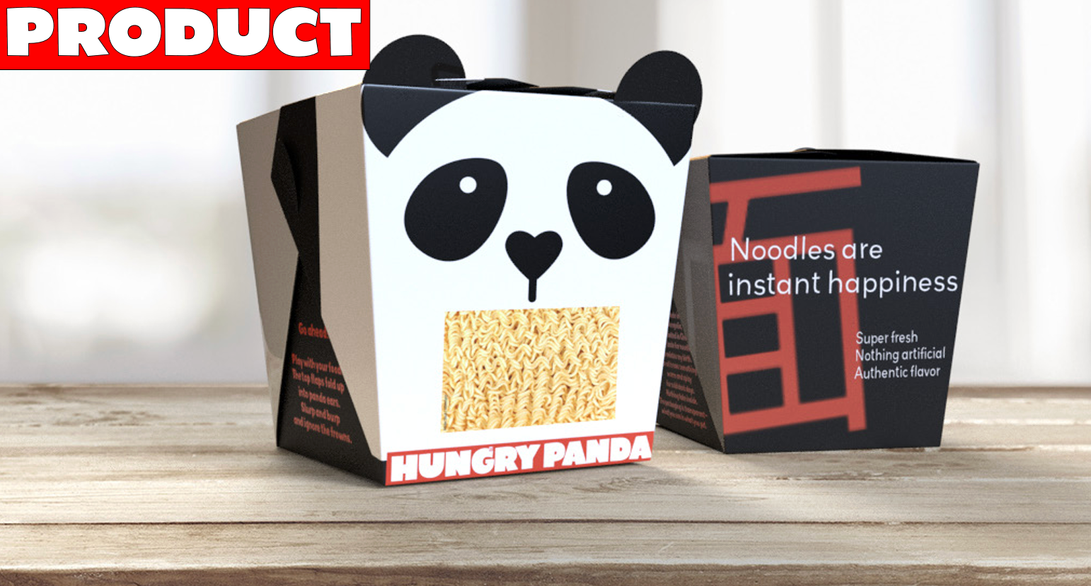
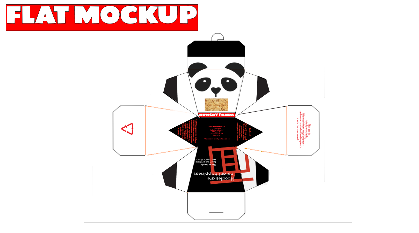
A die-cut window exposes the noodles inside the package, reinforcing the idea that nothing is hidden. What customers see is exactly what they get, emphasizing freshness and authenticity.
Structural Design
Instead of functioning as a simple box, the packaging creates an interactive moment. When opened, the top flaps fold upward to become the panda's ears, transforming the package into a playful character before the meal is even prepared.
Cultural Details
The large red Chinese character (面) appears on the back of the package and simply means "noodle," adding an authentic design element while remaining visually minimal.
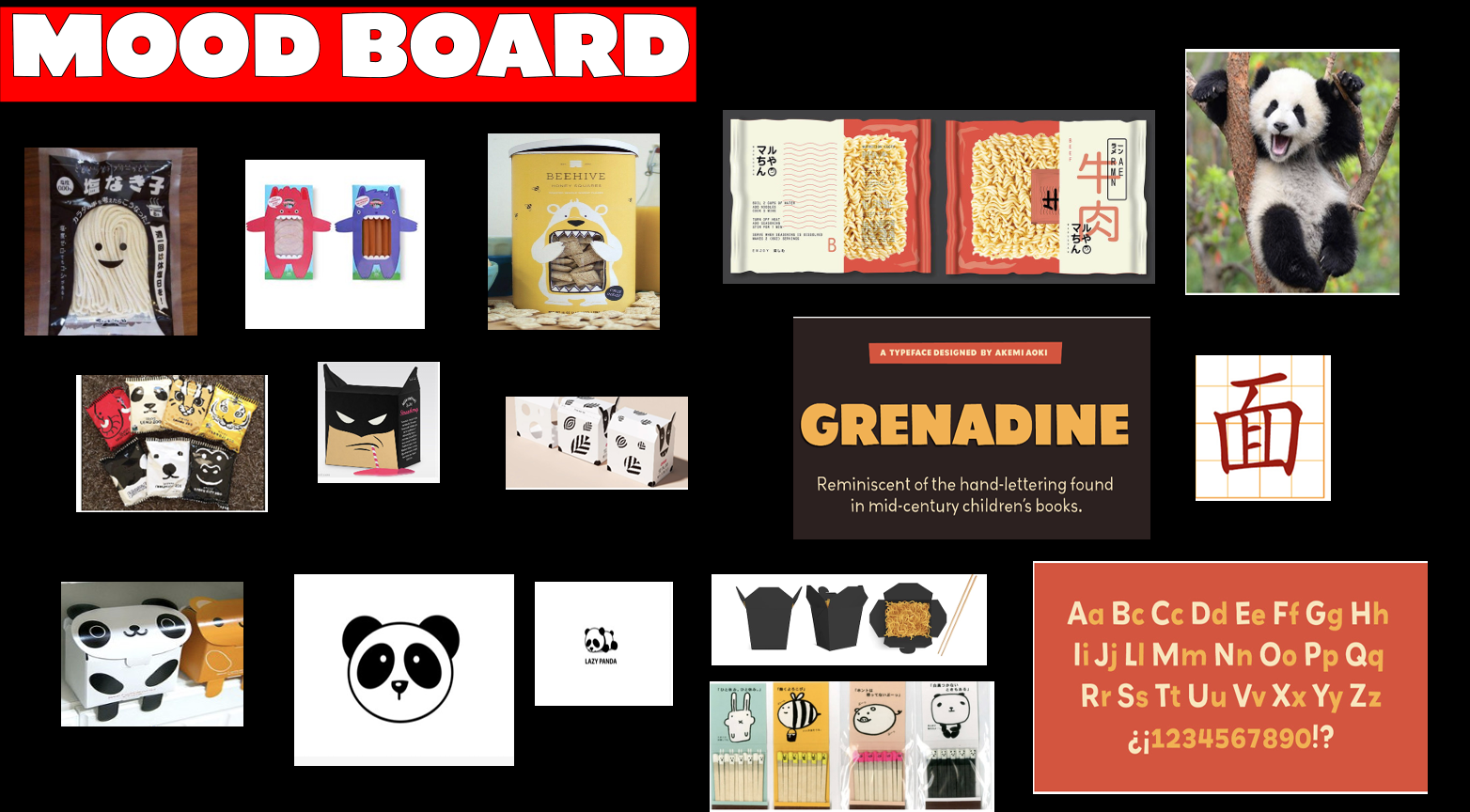
The project began with extensive visual research exploring existing noodle packaging, typography, mascots, structural packaging, and color palettes. Multiple layout ideas were explored before arriving at a clean geometric form centered around the panda illustration.
From there, I developed the flat dieline before constructing digital mockups to test how the graphics wrapped around the three-dimensional package and how the interactive folding ears functioned when assembled.
The final packaging balances personality with simplicity.
Key features include:
Interactive panda ears created through the folding top flaps
Die-cut window revealing the noodles inside
Minimal black, white, and red palette
Bold, playful typography
Authentic cultural references through color and typography
Packaging that transforms opening the product into part of the brand experience
This project taught me that effective packaging extends far beyond graphics. Every design decision—from color and typography to structure and interaction—contributes to how people experience a product.
Designing Hungry Panda strengthened my understanding of branding, structural packaging, typography, and visual storytelling. More importantly, it reinforced the idea that even everyday objects can create moments of delight through thoughtful, human-centered design.